
The nice design and rotating “flash news” feature of Lontano caught my eye, and I decided to give it a whirl on Beautiful Themer.
Author and Support
Lontano is a free WordPress theme by CrestaProject, a theme and plugin company located somewhere in Europe (my guess would be Italy). They have a dozen or so themes in the WordPress repository, plus another half dozen on their website that aren’t in the repository. The themes available at WordPress.org have a relatively small number of installations (a few hundred to 3,000), and 0-5 reviews, mostly favorable. All of the themes have been updated recently.
All but one of their free themes has a “Pro” paid version. The “Pro” version of Lontano costs about $32 US (price is in Euros, so the dollar equivalent may fluctuate). In addition to expanded theme options, you receive a year of support and updates. If you want to continue to receive updates, you have to renew annually. They do monitor and respond to questions about their themes on the WordPress.org forums, but Pro support is done from their own website, and only paid users may view previous responses.
Instructions
The installation process adds About Lontano to the Appearance submenu, but there is no documentation. Theme Info just takes you to the Free vs. Pro chart on their website.

However, the customization options are limited, and it is fairly obvious what each of them does, making it a good theme for a beginner, or anyone who finds too many options distracting.
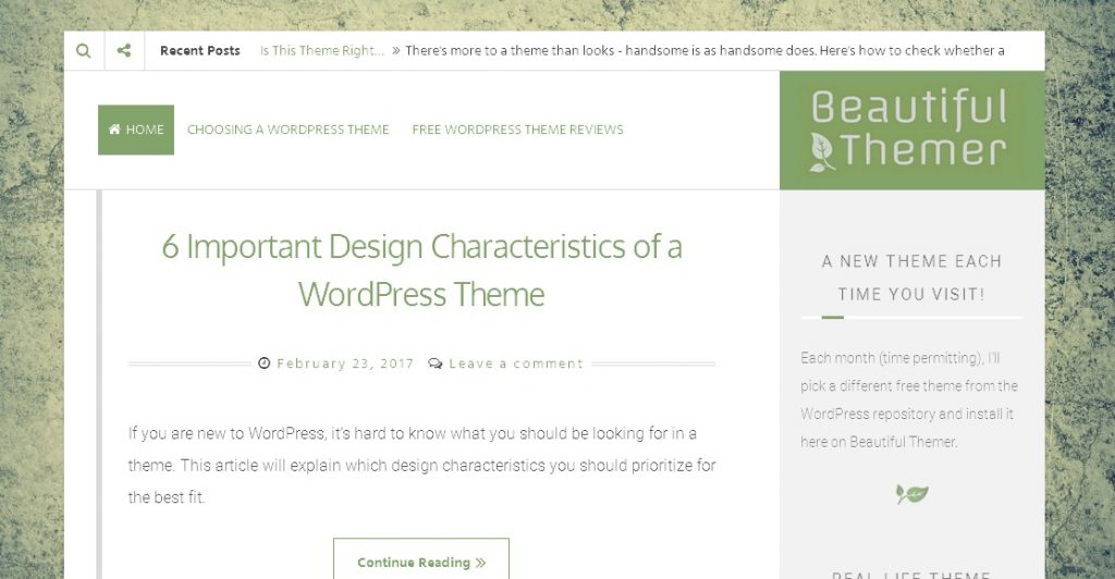
Branding
 In your header area, you can use a text site title with or without a tagline, or a logo. Because the header area contracts to the width of the sidebar in responsive view, the recommended logo size (300x100px) is too small to include a tagline, so you will probably want to stick with text if a tagline is important.
Luckily, I already had a logo I created at logomakr.com which I was able to crop and pop right in. I also have them to thank for the leaf favicon, which was an element of my logo.
![]()
There are no font options in the free version. I installed the Easy Google Fonts plugin to tweak the font for content text (body and sidebar), but you would need some understanding of CSS to change the font or size of the site title and tagline, both of which are on the small side. That’s one of the reasons I opted for a logo, so I could use larger text.
Navigation
There is one menu location, floating to the left of the right-aligned title/logo area on a wide screen, and contracting to an icon below the site title in narrow views (see above).
![]()
This arrangement will work best for sites where the top-level menu items are short and few. The menu looks OK wrapped to two lines, but starts to throw the design off if it has to wrap to a third line. Also, if you have longer menu items, as I do, there can be gaps when it wraps.
There is previous/next post navigation at the bottom of each post when viewed in its own page.
Topbar
There is an optional topbar. It can display a search icon, a sharing icon, and/or “flash news,” which is a rotating display of your recent post titles. The sharing icon is a toggle that opens a social media menu below your navigation menu, which is a little unexpected, and takes up a lot more vertical space than is needed. You can just type your social media id into the proper field, and the correct icon is automatically displayed. The number of social media services listed is more extensive than in many other themes.
![]()
It would make more sense to show the social media icons to the right of the sharing icon when it is clicked, moving the Flash News further to the right.
You can rename Flash News (I changed it to “Recent Posts”). It only shows the first 3-4 words of your post title, and however many words from the beginning of your post will fit in the leftover space. In the free version of the theme, there are no options to change what is shown (for example, showing the full post title only), or select specific posts to display.
Background
You can use a custom background image. I tried a transparent texture image over a solid gray-green background. That was nice, but a little too white.

I found a more dynamic image on pixabay. I selected the backgrounds/texture category, and filtered by color. The color tied in beautifully with the green titles, but the varied shades and asymmetrical texture kept it from being too monochromatic or heavy. I think it adds a lot of interest to the site – thanks, Pexels!
Posts
Lontano justifies post text (i.e., adjusts spacing between letters and words so that text always fills the whole line from the left margin to the right margin). I don’t like this, as it can create big gaps between words, especially when viewed on smaller devices with narrower columns. Luckily, it was easy to change it to left-aligned with a little custom CSS.
If you opt to show full posts on your blog page, note that the end of one post and the beginning of the next are not very well-defined. One way to improve this might be to install a plugin that adds social media icons at the end of posts on the blog index page.

Since my posts are long, I chose the option to use custom excerpts on my blog page. There is a checkbox for this buried in the Theme Options which is easy to miss. When checked, a large “Continue Reading” button is placed after the excerpt, which creates a clear break between posts.
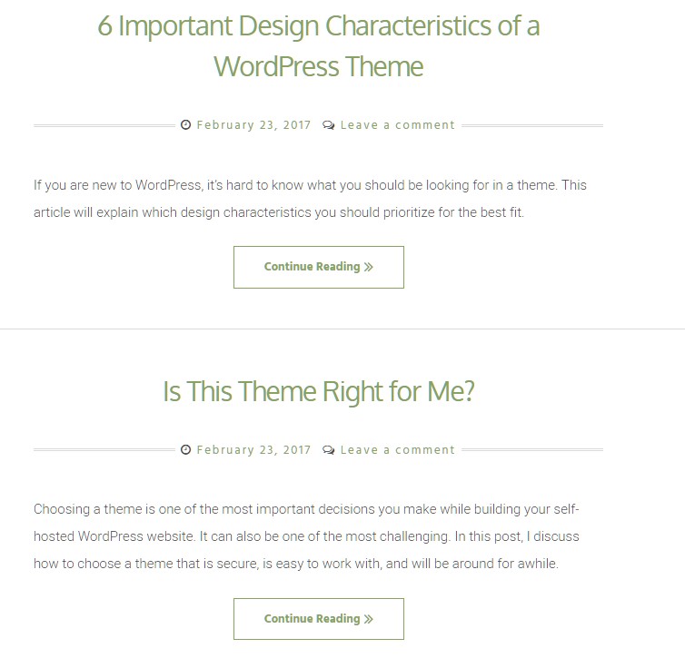
I tried using a featured image with the excerpt on the front page, but my images are mostly screenshots, with white backgrounds and text in the images, so the post excerpt below the image didn’t stand out well. This would be less of an issue for featured images with dark backgrounds and/or without text in the image. Note, though, that the featured image size is so large, visitors will not be able to see more than one post on the blog page without paging down.
 In responsive (phone) view, images that were right-aligned in desktop view did not always center with text below them as I would expect. Narrower images remained stubbornly right-aligned, even when the text area to the left of the image was only wide enough for one word, or when there was no text at all to the left of the image. A bit of a bug, I think.
Animations
There are a number of things that move in this theme: the “flash news” feed at the top, the move-on-hover underlines beneath widget titles, the decorative vertical line to the left of posts (which is optional), the color change upon hover of the menu and Continue Reading buttons. Featured images are also responsive to hover, and there is an up arrow that appears when you are more than one screen from the top. Excepting the news feed and up arrow, they serve no function other than to add design interest. Whether you find them fun to play with or distracting will be a matter of personal taste.
Widget Areas
![]() There is only one widget area, the sidebar. Similarly to the posts page, there is no line or other differentiation between widgets, so they tend to run together. I tried adding a horizontal line at the end of my text widgets, but it didn’t look good with the animated underline of the widget title. A rotated version of my favicon between text widgets worked somewhat better. This would be less of an issue for a site with more varied widgets that had their own internal frames, such as a calendar or tag cloud.
There is only one widget area, the sidebar. Similarly to the posts page, there is no line or other differentiation between widgets, so they tend to run together. I tried adding a horizontal line at the end of my text widgets, but it didn’t look good with the animated underline of the widget title. A rotated version of my favicon between text widgets worked somewhat better. This would be less of an issue for a site with more varied widgets that had their own internal frames, such as a calendar or tag cloud.
 When I added a text widget with Services to the sidebar, hand-coding for a bulleted list, I ended up with vertical blocks instead. I was able to resolve this by removing the opening and closing <ul> tags. I tried installing the Visual Text Editor plugin to add formatting options to the text widget, hoping to find a non-code solution for newbies, with the same result.
I tested bullets in pages and posts – they worked fine there. It is annoying but not unusual for bulleted lists to display incorrectly in sidebars – I have encountered it in several other themes. The code to make it work in this theme is not hard – just add <li> at the beginning of each line in your bulleted list, and </li> at the end of each line.
There are no footer widget areas in the free version of Lontano. You can add your social media icons to the footer from the Theme Options in Customize, but that is the only footer access the free version of this theme provides. There is not an easy way to add a copyright message.
It is easy to hide the promotional message with custom CSS, though I leave the theme credit visible on most of my sites, and encourage clients to do the same – it’s the least we can do for the free theme! However, some people feel it conflicts with the image of a successful business. Hiding the theme credit does not hide the social media icons.
Summing Up
Overall, this stylish theme gets high marks for design sensibility. Almost everything works, and works well. It handles responsiveness in a mildly novel way that differentiates it from other themes, without making it confusing or awkward. You can put together a pretty nice looking site in a reasonable amount of time with a couple of plugins and little or no CSS knowledge. It is an excellent blog theme, and could also be a good choice for a small business or individual service provider if not too many menu items are needed.
It is obvious that monetization is a priority for CrestaProject (they have affiliate links to a webhost on their own site, and they make sure you see the Free vs. Pro feature list in Customize and About Lontano). However, they are not obnoxiously pushy about it. The free theme offers enough in its own right that I might almost be tempted not to call it a freemium theme, if it weren’t for that lack of access to the footer. Being able to put a copyright notice on a website is necessary functionality, in my view, and a theme that holds back necessary functionality for ransom is not free, but freemium.
I’m also leery of Pro versions which must be renewed every year to receive updates. For a freelancer whose site doesn’t change much year to year, this expense could represent a significant increase in their annual website budget, and one they may be tempted to skip, with the inevitable result that they get hacked. I see a LOT of sites that were hacked due to update neglect, so I’m wary about anything that might discourage updating.
On the other hand, a more active user might have a couple of questions a year, in which case $32 isn’t much for good support. Unfortunately, since access to premium support questions and answers is restricted, it’s hard to judge how good it is. What I can say is that although the company is not U.S. based, the English on their website is excellent.
I also give CrestaProject points for posting custom CSS to move the sidebar from the right side to the left side on the free WordPress forums, as this is one of the features included in the Pro version. I always appreciate theme authors who encourage more adventurous users who are willing to learn a little code.
All in all, Lontano is a sound theme from a reputable company, and I would not hesitate to recommend it to a client who didn’t need the Pro theme options, or who was comfortable paying annually to keep the Pro version updated.